Better Data Visualizations

Ratings/reviews counts are updated frequently.
Check link for latest rating. ( 189 ratings, 19 reviews)Read More
Found a better price? Request a price match

Better Data Visualizations
Book Hero Magic created this recommendation. While it's new and still learning, it may not be perfect - your feedback is welcome! IS THIS YOUR NEXT READ?
Better Data Visualizations
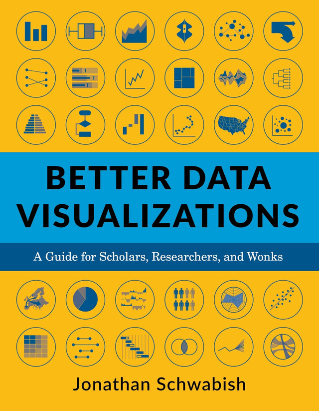
This book details essential strategies to create more effective data visualizations. Jonathan Schwabish walks readers through the steps of creating better graphs and how to move beyond simple line, bar, and pie charts.
Now more than ever, content must be visual if it is to travel far. Readers everywhere are overwhelmed with a flow of data, news, and text. Visuals can cut through the noise and make it easier for readers to recognise and recall information. Yet many researchers were never taught how to present their work visually.
Better Data Visualizations details essential strategies to create more effective data visualisations. Jonathan Schwabish walks readers through the steps of creating better graphs and how to move beyond simple line, bar, and pie charts. Through more than five hundred examples, he demonstrates the do's and don'ts of data visualisation, the principles of visual perception, and how to make subjective style decisions around a chart's design.
Schwabish surveys more than eighty visualisation types, from histograms to horizon charts, ridgeline plots to choropleth maps, and explains how each has its place in the visual toolkit. It might seem intimidating, but everyone can learn how to create compelling, effective data visualisations. This book will guide you as you define your audience and goals, choose the graph that best fits your data, and clearly communicate your message.
Book Hero Magic summarised reviews for this book. While it's new and still learning, it may not be perfect - your feedback is welcome! HOW HAS THIS BEEN REVIEWED?
Better Data Visualizations by Jonathan Schwabish is highly praised for its practical guidance on displaying quantitative information clearly and effectively. Reviewers commend it as an invaluable resource, celebrating the extensive taxonomy of visualization types and the well-thought-out design guidelines provided. This book offers readers an authoritative and accessible exploration of improving data communication, making it ideal for students, analysts, and professionals involved in data visualization. With a wide range of visualizations included, it's both informative and enjoyable to read.

Book Details
INFORMATION
ISBN: 9780231193115
Publisher: Columbia University Press
Format: Paperback / softback
Date Published: 09 February 2021
Country: United States
Imprint: Columbia University Press
Illustration: 533 color charts, graphs, and illustrations. 1 table
Audience: General / adult
DIMENSIONS
Width: 178.0mm
Height: 229.0mm
Weight: 0g
Pages: 464
About the Author
Jonathan Schwabish is an economist and writer, teacher, and creator of policy-relevant data visualizations. He helps nonprofits, research institutions, and governments at all levels improve how they communicate their work and findings to their colleagues, partners, clients, and constituents. He is the author of Better Presentations: A Guide for Scholars, Researchers, and Wonks (Columbia, 2016).
More from Education & Reference
View allWhy buy from us?
Book Hero is not a chain store or big box retailer. We're an independent 100% NZ-owned business on a mission to help more Kiwis rediscover a love of books and reading!

Service & Delivery
Our warehouse in Auckland holds over 80,000 books and puzzles in-stock so you're not waiting for your order to arrive from overseas.

Auckland Bookstore
We're primarily an online store, but for your convenience you can pick up your order for free from our bookstore, which is right next door to our warehouse in Hobsonville.

Our Gifting Service
Books make wonderful thoughtful gifts and we're here to help with gift-wrapping and cards. We can even send your gift directly to your loved one.


